2020 has been a year of unprecedented events, and it is now Pantone® has announced two colors of the year for 2021. PANTONE Ultimate Gray and PANTONE Illuminating.
In Pantone’s 22 year years, 2021 is only the second time two colors have been selected. Rose Quartz and Serenity were chosen in 2015. This year, the two shades are meant to stand on their own, as complementary tones, supporting each other. This is also the first time a gray has been recognized as a color of the year. Both of these colors were added to the Pantone color wheel in 2020.
The union of an enduring Ultimate Gray and the vibrant yellow illuminating expresses a message of positivity supported by fortitude. Practical and rock-solid but at the same time warming and optimistic, this is a color combination that gives us resilience and hope. We need to feel encouraged and uplifted; this is essential to the human spirit.
-Leatrice Eiseman, Executive Director of the Pantone Color Institute
Ultimate Gray
RGB:
147 149 151
HEX:
#939597
Illuminating
RGB:
245 223 77
HEX:
#F5DF4D
How to use these colors in graphs?
With similar color schemes that include a gray, the more vibrant color is used to demonstrate the story. In this case, the yellow will be used to guide the eyes of the audience to the important information.
Multiple data points to communicate
Sometimes you need more than two colors to communicate your ideas. Using complementary, triadic, tetradic, or different tones of the original color, increases the total number of options available.
Complementary Colors
Complementary color schemes are made by picking two opposite colors of the color wheel. They appear vibrant when used next to each other.
Ultimate Gray
RGB:
147 149 151
HEX:
#939597
Illuminating
RGB:
245 223 77
HEX:
#F5DF4D
Ultramarine Blue
RGB:
77, 99, 245
HEX:
#4D63F5
Triadic Colors
Triadic color schemes are created by picking three colors equally spaced on the color wheel. They appear quite contrasted and multicolored.
Ultimate Gray
RGB:
147 149 151
HEX:
#939597
Illuminating
RGB:
245 223 77
HEX:
#F5DF4D
Turquoise Blue
RGB:
77, 245, 222
HEX:
#4DF5DE
Fuchsia
RGB:
222, 77, 245
HEX:
#DE4DF5
Tetradic Colors
Tetradic color schemes are made from two couples of complementary colors in a rectangular shape on the color wheel. They are very versatile and work best with one dominant color.
Ultimate Gray
RGB:
147 149 151
HEX:
#939597
Illuminating
RGB:
245 223 77
HEX:
#F5DF4D
Screamin Green
RGB:
99, 245, 77
HEX:
#63F54D
Fuchsia
RGB:
222, 77, 245
HEX:
#DE4DF5
Ultramarine Blue
RGB:
77, 99, 245
HEX:
#4D63F5
Holidays are a great reason to use a different color scheme in your graphs and presentations. The traditional colors of the holiday aren’t always the best to use in graphs. For example, the Christmas colors of red and green are difficult on the eyes are not the best visualization for data presentation. Even though the colors red and green are in a triadic combination, there are better colors to use that still have the “Christmas” feel.
Darker colors like blue and brown give the winter feel. These colors make you want to sit in front of a fire sipping hot cocoa. If needed for multiple data points, use a decreasing transparency scheme with the secondary color. In this example, the secondary color is blue.
Brown
rgba(175, 128, 80,1)
Hex: #AF8050
Blue
rgba(3, 88, 127,1)
Hex: #03587F
Silver and Gold are iconic Christmas colors. These two colors are subtle and balance each other nicely. If needed for multiple data points, use a decreasing transparency scheme with the secondary color. In this example, the secondary color is silver.
Gold
rgba(212,175,55,1)
Hex: #D4AF37
Silver
rgba(192, 192, 192,1)
Hex: #C0C0C0
Green and purple are complementary colors, two colors that are on opposite sides of the color wheel. The main colors being purple with different transparencies of green as the secondary color.
Cream
rgba(253, 248, 220,1)
Hex: ##FDF8DC
Red
rgba(239,52,61,1)
Hex: #EF343D
Green and purple are complementary colors, two colors that are on opposite sides of the color wheel. If needed for multiple data points, use a decreasing transparency scheme with the secondary color. In this example, the secondary color is green and the main color being purple.
Dataset B
rgba(53, 86, 81,1)
Hex: #355651
Dataset A
rgba(108, 55, 119,1)
Hex: #6c3777
Depending on the number of variables needed to be presented, a vertical bar graph may not be the best option. Text along the x-axis of a vertical bar chart that needs to be tilted to fit is harder to read. Labels on a horizontal bar graph are positioned left to right, natural reading order for a majority of the population.
Horizontal Bar Graphs help the audience can compare from data point to data point.
Categorical graphs will show trends between different categories.
The area along the y-axis allows for easy to read labels for multiple items.
Single Variable
Horizontal Bar graphs display categorical data as it represents as a value. The purpose of this chart type is to compare and represent the trend of several variables.
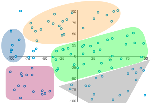
Cluster graphs are a way to understand relationships within the data. Cluster graphs are dependent on identified nodes where the nodes are the center of the clusters. There can be multiple relationships within a single data set.
Cluster Graphs start with showing how categories are related, similar to Scatter Graphs.
Cluster Graphs show the relationship between the two variables, X and Y.
Cluster Graphs take analytics to the next level, by identifying patterns within the data and ``clustering`` them together. The insights from these visuals can create data models.
Cluster Graphs
When the principal of common region is applied, the graphs show 5 different areas of meaning as well as some outliers. The presenter can go into more detail for each of the areas (some more significant than others).
Similar to a Scatter Chart, the Bubble Chart is used to show a relationship between variables. But unlike the Scatter Chart, which can only show two variables, the Bubble Chart is able to show a third variable represented in the size of the bubble.
Bubble Charts show how categories are related. Helps the viewer compare the connection or association between each category.
Bubble Charts are able to show relationships with three variables.
Bubble Chart
Bubble Charts have the same visual feel as Scatter Charts, with the added advantage of the introduction of a third data element. Using the size of each
as a “bubble” instead of as a “dot” to show the magnitude of the third data element.
Area graphs are used to show how a total and their shares developed over time. This type of graph shows part-to-whole relationships by showing volume as well as change over time. Because the area graph is communicating trends over time vs. individual data points, using this graph correctly can make a compelling overall story. There are three types of area charts: standard, stacked, and 100% stacked.
Area Graphs combine distinct parts, elements, categories, or processes into one visual. Helping the view understand how such parts are related.
Area Graphs are able to show data trends over time. These graphs are great at showing many dates or time periods in one single image.
Area Graphs are great at showing many dates or time periods in one single image.
Absolute Differences
Stacked Area Graphs show distinct data points, trended, and the cumulated picture. Use this type of graph when the audience needs to know the value for each data point.
Relative Differences
100% Stacked Area Graphs show relative data points as percentages, trended, and the cumulated picture. Use this type of graph when the audience does not need to know the value for each data point.


